Summary: Today, more and more sellers want to reach their customers online. However, there are plenty of concerns one should be aware of when starting a web store. Most importantly, if your web store is not user-friendly it could literally ruin your online business. Follow our 7 simple advice at What a Figure! Ecommerce Accounting to boost your revenue!
1. Excellent mobile shopping experience
Creating a mobile-friendly experience for your shoppers will improve sales. For instance, Walmart increased mobile sales by 98% after optimizing its mobile site.
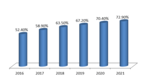
Mobile as share of total e-commerce worldwide*

*-Source: Statista
E-commerce businesses can’t ignore these trends and must adapt their companies to it.
If you plan on running a successful web store you must make it comfortable for mobile users and consider mobile shopping. It must be a major part of your digital marketing strategy.
Not doing so is simply overlooking a majority of your potential customers.
Mobile phones enable consumers to shop wherever they are. All they need is an internet connection.
Thankfully, nowadays almost all web store builders allow creating beautiful mobile versions of online shops.
Furthermore, you can always check if your site is mobile-friendly with Google (Mobile-Freiendly test).
2. Add a wish list feature to your web store
Not all purchases are planned; lots of them are made spontaneously. Some people just browse around with no intention to buy something or don’t know what they want exactly. Your web store should be established in a way to transform every passive visitor into a customer. Let them create a wish lists!
A wish list is a collection of products potential customers want to buy and save them for future reference.
This feature can become a clue to your web store’s success because of the following reasons:
- Improves customer’s experience, creates an opportunity to save items “for later” and return whenever it’s comfortable for them.
- Provide insight into customers’ world, their wishes and way of thinking – really precious information for your marketing campaigns.
- It can drive a lot of traffic – make a wish list shareable and this will attract more visitors and raise awareness of your brand and products.
- Drive customer engagement – you can send customers reminders or notify them when items have gone on sale: it can pull them back to complete the purchase.
3. Related item feature
Let’s say a customer types “black jacket” on your website. If you have no products labeled as such, the visitor will probably see a “No results found” message on the screen.
Customers will leave your web store if the item they are looking at is not available and they don’t find relevant alternatives.
Displaying visually similar items helps increase conversion. Moreover, it also reduces site abandonment caused.
While the main focus should be on the product, there’s also an opportunity to display and cross-sell complementary products.
You can make it easy for customers to continue shopping, and drive conversions by positioning recommended products in a visible and appropriate location on a product page.
You can also stimulate to buy more.
Let’s say a customer has bought a phone on your web store – it would be reasonable to propose him phone accessories or other related products.
For example, while setting up an online store on BigCommerce you can enable a “you might like this” feature just by one click.

Such an easy task to complete but it could greatly boost your revenue!
4. High-quality product photos/videos.
We’ve already forgotten those days of uploading only one photo to a web store with a few bullet points and a price tag.
Shoppers want to see multiple angles and people using the product in different environments. They want to be able to zoom in and get a feel for the product.
Technical considerations for images are crucial.
Images that don’t load or take too long to load will see a consumer drop-off rate of 39%, according to Adobe.
If you have different versions of a product, make sure you include images of all variations. Use images with context to show how the products will look like if your shoppers were using it.
It doesn’t matter how beautiful your images are if they don’t answer the question: “How would it look if I were to use it?“
Make a video using the product and show your shoppers how it works.
You can also discuss important benefits of the product that can’t be easily shown in pictures. Just by watching a person hold, touch, and interact with the product while explaining its pros and cons is like visiting a store and talking to a salesman.
This trick can create more trust to your web store and encourage people to buy.
5. Web store payment options
Without a doubt, filling out long forms every time when you make a purchase through a web store is annoying.
The difference between just clicking “buy” at an online shop I regularly buy from or having to fill out a form at a new store for the first time, makes a huge difference.
It will result in customers returning to the shop that makes it easier. Even if it’s slightly more expensive.
One-click buying across multiple platforms, instant automatic downloads, all without needing to fill in any details, makes online shopping seamless.
It’s crucial to give your customers the ability to purchase via preferred payment method and that may include payment gateways like PayPal or Stripe, digital wallets and mobile-based payment systems.
There are hundreds of them all over the globe nowadays. The most popular, however, is PayPal.
PayPal introduced the express checkout process to reduce the number of clicks for a customer, ultimately increasing conversion rates for e-commerce stores.
Making the checkout experience as quick and simple as possible results in much higher checkout conversion rates and ultimately, much higher online sales.
Shopify has a comprehensive list of all the major payment gateways around the world and instructions on how to integrate them into your store. It helps to choose the right one for you depending on the location of your target audience.
6. Use a unique domain for your web store
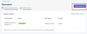
Let’s say you’ve just created your shop using Shopify. In this case your store’s domain name looks like “www.storename.myshopify.com.”

You can easily purchase your domain through a domain register like Namecheap or GoDaddy and it will give you a professional-looking domain.
You should choose your domain name very carefully as it will represent your web store. Try to choose a professional, niche specific name.
Avoid very long domains and domains with digits.
It’s also preferable to select “com.” domains as they are widely considered to be more trustworthy, therefore helping you to attract more customers.
7. Web store information and pages
Don’t forget that many potential customers still have concerns whether they can safely make purchases online.
It’s important to add an “About Us” page where customers can read who has created the store, your values and story of your brand.
It will help to become more engaged with your buyers.
Also your web store should have a “Contact Us” and FAQ pages.
This will help customers to get in touch in case of some problems or just to find an answer by themselves.
Lastly, the most important is “Returns & Refunds Policy” page.
If you don’t have clear information on how your return process works, there is a high chance that customers may choose to purchase elsewhere.
We hope this article helped you to scale your online sales. If you have any questions or other suggestions, let us know in the comments below!

